Showing posts with label Design. Show all posts

06 December 2016

Early Exploits in User Experience

Years ago, I made a control panel for a laser system. The lab director, Dr. Ken ~~~~, had a habit of randomly changing settings on your perfectly calibrated equipment. To prevent this, the panel had a toggle switch that was labeled “TUNING” and switched between “MANUAL” and “AUTOMATIC”. There were three very fancy knobs that even had little Vernier dials:

They were labeled something like “OFFSET”, “DEAD BAND”, and “GAIN”, if I recall correctly. There was also an LED that could change from yellow to red.

Of course, the switch and knobs weren’t connected to anything and the light was connected to a little circuit that had a photocell. If someone stood in front of the panel for a couple of minutes, his or her shadow would cause a capacitor to drain until a transistor would reverse the polarity on the LED and it would change colors. Since there was no label about whether red or yellow was good, Ken would wander by on occasion and tweak the knobs until it changed to the other color.

The whole thing had been built as an April Fools’ prank and was quite satisfactory. Access to the real settings required you to unscrew and remove the aforementioned panel, whereupon you could change the actual controls, which were mounted on the electronics chassis itself. Since this was usually accompanied by considerable swearing and yelling across the football-field sized basement laboratory, it was never done except late at night, so Ken never caught on.

Because we were funded by the Department of Energy, which would send bureaucrats from Washington to ensure that we were spending the money properly, all of our gear was abundantly outfitted with dials and blinking lights, which twitched and flashed in dramatic fashion. This reassured the bean counters, who had absolutely no idea of what they meant. This was all the way back in 1979 and almost certainly represented my first explorations into the difference between user interface and user experience.

15 November 2016

Aaarrrrggghhhh!

Vertikles critiqued this blog the other day and said that it looked like it had been created twenty years ago by an eccentric crank. I wasted no time in quickly whipping off a reply castigating him for his lack of taste and his indiscerning eye for the stylish. Having quickly dispatched of the unwarranted commentary, I returned to contemplating my next post. In the back of my mind, I was still stewing about his e-mail. He kept calling it a 19 point font. Hah! That shows what he knows. All of the text is actually sixteen pixels high. Still, he did come back to that point three times and in all of the years that I've known Vertikles (a number that makes nineteen look very small), he is nearly always correct about these details.

So, to appease my indignation, I quickly searched the text for '19px' and son of a gun, there was one spot in the code where body text was set to nineteen pixels. To understand how this could occur, you must realize that Blogger templates are a mashup of HTML, CSS, Javascript, and Google voodoo. Furthermore, I was using a Blogger template that I had extensively modified (the attribution is in the source code, but I made so many changes that I didn't think it fair to either party to have the author's name on the page) and which had been written by someone with what must be delicately called poor code hygiene. Somewhere along the line, a 16 had been changed to a 19. So I changed it back.

And by Crom, now the page looked terrible.

I knew that all of the sizes were right, but the smaller text swam in white on the black background. Vertikles had also railed against my use of Raleway as the body font, but I rather liked it. Except that in the small size, it was all but unreadable. The nuances that make it interesting blurred together into a gummy mass. To make bad matters worse, the little things that annoyed me that I hadn't gotten around to fixing, like the spacing on the cast and inventory lists in the movie reviews, were even more obvious with the smaller font size.

Aaaaarrrggghhh!

So, some twenty hours of my life later, it's much nicer, at least in my opinion (and Vertikles would be wise to keep his thoughts to himself for a few weeks). I've rolled back to an earlier color scheme, made some tweaks to links when you hover over them, fixed the Crom-damned list spacing, and even changed the text font. Vertikles will still be displeased, but I don't care. I can't stand text fonts where you can't tell a lowercase 'L' from an uppercase 'I' or the number '1'. I also like editorial typefaces to have a bit of character (sorry), with a few distinctive characters. I had almost gone to something really trendy, but my predilection for pompous verbosity meant that the resulting deluge of sesquipedalian prose would be even more unreadable unless I chose carefully. In the end, looking through the Google fonts, as well as those that I have a web license for, I chose Museo Sans, which is quirky enough for my taste, while still being readable in a paragraph of text.

In the next day or so, I'll get around to another Amazon posting. The little gnomes who make the suggestions have been working overtime there and I have bumper crop of artificial stupidity to spring upon you. Until then, Tschüß.

15 October 2016

Product Marketing 101

I do a little graphic design work for fun, which of course means that I get boatloads of spam from companies selling stock photography, fonts, and various odds and ends. I've managed to eliminate most of the really awful stuff, so most of what I get is high quality, if generally not of much use. For example, the last week consisted of a rather remarkable run on coffee mug mockups. These are Photoshop files that let you take your graphics and project them onto a mug, as viewed from any of a number of locations, including full or empty, on the desk or in the hand, or even in an attractive gift box. It's how you market designs without the expense of having to actually make the mugs. Last week, for some reason, I got about ten of these, including various sizes, materials, shapes, and other characteristics. As I said, they're all very well done, but I'm not really interested in selling mugs this week.

There are also vast numbers of templates for dance clubs, bars, sporting events, etc. You basically fill in the appropriate names and dates and print off a few hundred to get hung on bulletin boards around college campuses and bus stops. The quality of these range from mediocre to unspeakable, but they probably accomplish the desired result and at almost no cost. I've got these packing off to my spam filter.

In between lies the stock photography. About a decade ago, there was a stock photography model who ended up in every computer ad for every company on Earth. She became known as "everywhere girl" and was eventually located in real life, where it turned out that she was a college student who made a couple of hundred dollars one day having about a thousand photos taken of her using various computers, carrying them across campus, sitting in classrooms, etc. Ironically, she was completely unaware that she had become an internet sensation.

If you have a need for a one-off photo, there are many services that can sell you one, with the appropriate rights for reproduction (please don't just grab them off the web—that's a good way to get sued). If you are going to do a series of ads or if you are doing a presentation, you might want to get a number of related photos, either of the same style or the same people. These come about a dozen at a time with titles like, "Excited Interracial Business People", which is a group of young, mixed race and sex professionals demonstrating more enthusiasm in a business meeting than would normally be expected. There are also healthy numbers of "Attractive dark-haired woman with perfect skin and makeup". Sets such as these are available in every imaginable combination of ethnicity, hair and eye color, makeup or natural, and range from prudish to mildly titillating. Women outnumber men about ten to one in these sets, which is indicative of something.

Today, in the utterly non-titillating line, I received an offer for fourteen photos of a "Happy girl in a pink dress with balloons is standing on the background of the waterfront". Indeed, there is a blonde woman, whom I would consider to beyond the age of "girl", being in her late twenties, wearing a long pink dress and standing on large rocks that look like a breakwater jutting out into the ocean. She has long hair, is wearing what appears to be a tiara, although I suspect that it is a hairband of some kind, and she has a bundle of about a dozen balloons of the same color as her dress. The balloons are not inflated with helium, so in a couple of the pictures, she is holding them above her head. In all but one of the pictures, she has a rather vacuous smile, with the exception being one in which she is blowing a kiss. There is no conceivable erotic value and with the possible exception of anti-psychotic drugs, there is no possible product that you could imagine using these to sell. Although well-exposed, they have no artistic merit and it's really not possible to think of any potential use for them.

This is a perfect example of a product without an audience. I am almost tempted to buy the set to use in a presentation on building a product without doing customer research. I believe that it falls within 'fair use' to show you a tiny version of one of the photos, just to provide context.

Should you think of a use for this set, I'd love to hear it. Also, suggestions as to how she got out onto those rocks in that dress would also be appreciated.

Great Moments in Product Design

So, on Wednesday, Aphrodite and I were invited to the elementary school where our kids had gone to speak to the students about our careers as engineers. These were pre-kindergarten through fifth-grade students, fairly evenly divided.

Aphrodite, being who she is, gave an excellent talk on Test Engineering, with photos and videos. Me, being me, did a design exercise on how to build a bug catcher. The kids were good and had lots of good ideas (way too many, but that's typical of adult design exercises, too).

One boy, probably in kindergarten, proceeded to give me the single best design that I'll ever hear. He politely raised his hand and waited until he was called upon. When it was his turn to speak, he very precisely described how, if you wish to catch spiders, you need a bowl with steep sides about this high (using his fingers to indicate about an inch). You set this on the floor and then you place a dead hand in the middle and all the spiders will come and be trapped in the bowl.

A dead hand?

Yes. Spiders are really attracted to dead hands.

Several other students solemnly agreed that dead hands worked especially well for spiders, His teacher was frantically trying not to laugh out loud. I looked at him as he stood seriously looking back at me, waiting for feedback, and said, "I'll be sure to get the test engineers working on that, but I think that we may have trouble getting it past Product Compliance and the Branding departments."

He nodded knowingly and we continued the exercise.

08 August 2016

Some People Need More Help Than Others

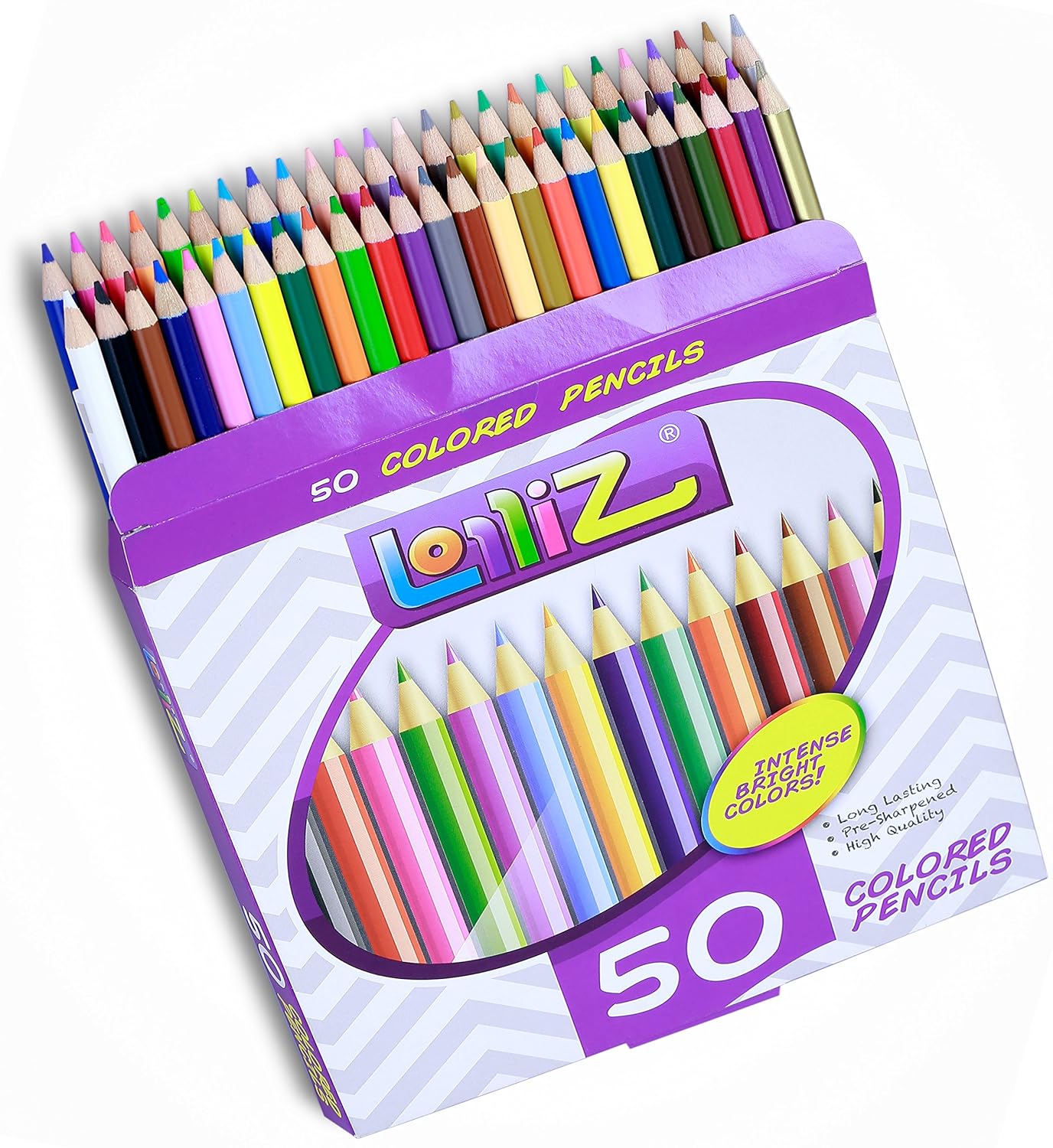
So, on Amazon, I came across a box of colored pencils. They are highly rated and reasonably priced. I did notice that there were a surprising number of questions associated with them, which puzzled me. The first question was: "Are the pencils marked what color they are?" Six people answered, all saying some variation on "No, they are not."

When I look at these pencils, the question, "What color is this pencil?" doesn't come to mind. Clearly I lack imagination. I see several green pencils, a few yellows, a white, a black, etc. Perhaps if you can't tell what color the pencil is, you shouldn't be using them. I mean, if you want your leaves to be dark green, you pick up the dark green pencil. If you're looking for early spring leaves, you pick up a lighter green.

I could understand, if these were professional graphic artist tools, how someone might want the Pantone number on the pencil, although I would argue that because of variation in coloring style, it would be meaningless. It's kind of sad to think that there are people wandering this Earth who can't buy colored pencils because they are confused between which one is lilac and which is lavender.

29 March 2006

That's Why They Call It "Running an Ad"


Sometimes you have to wonder what possesses a company to run the ads that they do. Did anyone at this briefcase company really think about whether it was a good idea to put a picture of someone stealing a briefcase on their website?